

Active
Project Alpha
Innovative design system implementation
A versatile List Collection component for vertical list layouts with images, stacked content (title, description, meta), and dropdown action menus.
The simplest form displays a vertical list with default styling and separators between items.
Active
Innovative design system implementation

In Progress
Next-generation user interface redesign

Planning
Mobile app performance optimization
Use variant="card" for elevated cards with shadows.
Active
Comprehensive plan for product launches
Draft
Updated visual identity standards
Add dropdown action menus to list items using the actions prop. Actions appear as a 3-dots menu on the right side.
Facilitator
Group facilitator, Tuesday evening group
Facilitator
Programme facilitator, Exodus Recovery Skills
Member
In active recovery, 6 months
Use renderMeta to display badges, icons, or custom components for the meta content.
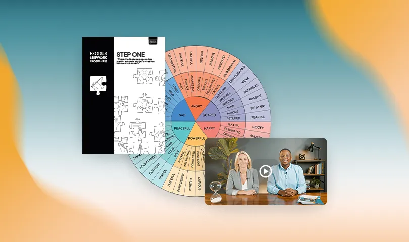
Operational guide for running recovery groups
Member safety and reporting procedures
Posters and social assets for your group

Archived session notes from a retired programme
Make entire list items clickable using href for links or onItemClick for custom handlers.
| Prop | Type | Default | Description |
|---|---|---|---|
items | ListCollectionItem[] | Required | Array of items to display |
size | "default" | "compact" | "default" | Size variant controlling spacing and typography |
variant | "default" | "card" | "default" | Visual style variant |
imageShape | "square" | "circle" | "square" | Shape of item images |
titleStyle | "simple" | "bold" | "simple" | Font weight for titles |
metaPosition | "above-title" | "below-title" | "above-title" | Position of meta content |
limit | number | undefined | Maximum number of items to display |
onItemClick | (item, index) => void | undefined | Handler for item clicks |
renderMeta | (meta, item) => ReactNode | undefined | Custom meta renderer |
renderActions | (item, index) => ReactNode | undefined | Custom actions renderer |
clampTitle | boolean | number | undefined | Clamp title text (true = 2 lines, or specify number) |
clampDescription | boolean | number | undefined | Clamp description text (true = 2 lines, or specify number) |
itemAs | "div" | "article" | "article" | HTML element for items |
className | string | undefined | Additional CSS classes |
| Prop | Type | Required | Description |
|---|---|---|---|
title | string | Yes | Item title |
description | string | No | Item description |
meta | string | ReactNode | No | Meta content (category, date, status) |
image | string | No | Image URL |
imageAlt | string | No | Alt text for image |
id | string | number | No | Unique identifier |
href | string | No | Link URL (makes item a link) |
onClick | () => void | No | Click handler for this item |
imageShape | "square" | "circle" | No | Override collection imageShape |
titleStyle | "simple" | "bold" | No | Override collection titleStyle |
metaPosition | "above-title" | "below-title" | No | Override collection metaPosition |
actions | ListCollectionAction[] | No | Action menu items |
ariaLabel | string | No | Accessibility label |
| Prop | Type | Required | Description |
|---|---|---|---|
label | string | Yes | Action label |
onClick | () => void | Yes | Action handler |
variant | "default" | "destructive" | No | Action variant |
icon | ReactNode | No | Optional icon |