
Image component built on Next.js Image with three sizing modes: explicit (width + height), constrained (one dimension + aspectRatio), and responsive (aspectRatio + Tailwind classes).
Basic Usage
Responsive with Aspect Ratio
Use aspectRatio with Tailwind responsive classes for container-responsive images.

Width-Constrained
Specify width + aspectRatio for images with fixed width and proportional height.
Height-Constrained
Specify height + aspectRatio for images with fixed height and proportional width.
Aspect Ratios
All standard aspect ratios for modern web and mobile applications.
16:9 (Widescreen)
9:16 (Portrait)
1:1 (Square)
4:3 (Standard)
Preset Sizes
Convenience presets for common widths (xs: 64px, sm: 96px, md: 192px, lg: 384px, xl: 512px).
xs (64px)
sm (96px)
md (192px)
Fit Options
Control how images fill their containers: cover (fills container, may crop) vs contain (fits entirely, may have space).
Cover (default)
Fills container, may crop
Contain
Full image visible
Rounded Variants
Choose from multiple corner radius options.
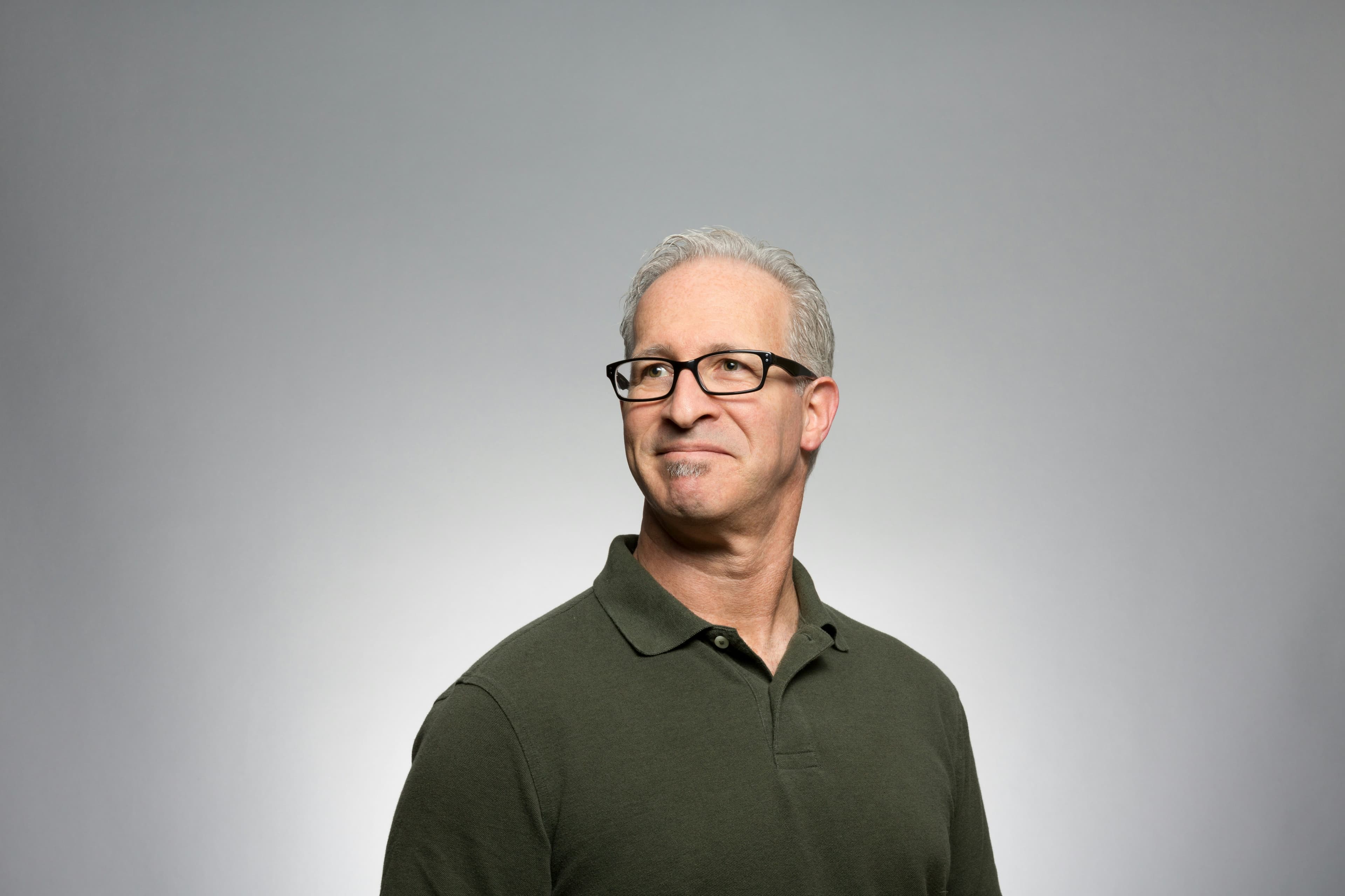
Avatars & Profiles
For circular profile images, use the Avatar component directly for optimal rendering.
Interactive Features
Enable openOnClick to display images in a full-screen lightbox.
Error Handling
The component automatically handles image loading errors with fallback content.
// Default fallback (shows first 2 characters of alt text)
<Image
src={failedUrl}
alt="Fallback Demo"
width={80}
aspectRatio="1:1"
rounded="full"
/>
// Custom fallback content
<Image
src={failedUrl}
alt="Custom Fallback"
width={80}
aspectRatio="1:1"
rounded="full"
fallback={<span className="text-xs">🖼️</span>}
/>
// With error callback
<Image
src={imageUrl}
alt="Image"
width={200}
aspectRatio="1:1"
onError={() => console.log('Image failed to load')}
/>Common Patterns
Real-world usage examples for typical UI scenarios.
Profile Card
John Doe
Product Designer
Product Grid
Product Name
$99.00
Product Name
$149.00
Product Name
$79.00
Hero Banner
Explore Nature
Discover breathtaking landscapes
Story/Portrait Format
Props
| Prop | Type | Default | Description |
|---|---|---|---|
src | string | - | Required. Image source URL |
alt | string | - | Required. Alternative text for accessibility |
width | number | string | - | Fixed width in pixels or CSS value |
height | number | string | - | Fixed height in pixels or CSS value |
aspectRatio | "1:1" | "4:3" | "3:2" | "16:9" | "21:9" | "9:16" | "2:3" | number | - | Aspect ratio constraint |
preset | "xs" | "sm" | "md" | "lg" | "xl" | - | Preset width (64/96/192/384/512px) |
fit | "cover" | "contain" | "cover" | How image fills container |
objectPosition | string | - | CSS object-position value |
rounded | "none" | "sm" | "md" | "lg" | "full" | "md" | Corner radius variant |
loading | "lazy" | "eager" | "lazy" | Image loading strategy |
priority | boolean | false | Next.js Image priority loading |
openOnClick | boolean | false | Enable lightbox on click |
onClick | () => void | - | Custom click handler |
fallback | ReactNode | - | Custom fallback content for errors |
onError | () => void | - | Error callback |
className | string | - | Image element classes |
containerClassName | string | - | Container element classes |